AjaxTextField
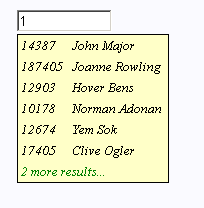
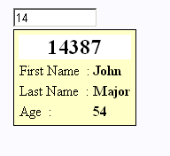
AjaxTextField is a text field component that displays table-like pop-up selection boxes when the user types the text. The content of the pop-up select boxes is dynamically requested via AJAX. This is handled by a Java method on the page's/component's class. The user can select one of the rows of the box both by up-down-ENTER key navigation or with the mouse.
Screenshots


Features
- Very simple use but highly customizable
- The select box is rendered as HTML-table. Hence columns are rendered correctly
- It is possible to display differently rendered rows in one single box including use of colspan and rowspan.
- Mixing of row types and content is dynamically triggered by the AJAX response
- You can specify client side JavaScript handlers
- All renderers are specified in the HTML template
- Very simple API for the server side AJAX responses
- Supports all properties of the normal Tapestry TextField including validators, delegate markers, etc..
Possible Problems
-
MSIE shows the pop up boxes half over the text field:
This happens when the following HTML doctype declaration is used<!DOCTYPE HTML PUBLIC "-//W3C//DTD HTML 4.01 Transitional//EN" "http://www.w3.org/TR/html4/loose.dtd">
Since this is the default doctype produced by the Tapestry @Shell component, you must choose another doctype, if you want to use the @Shell-component, for example:<span jwcid="@Shell" title="..." doctype="HTML PUBLIC "-//W3C//DTD HTML 4.0 Transitional//EN" ">
WarningIf you use AjaxTextField together with the @Shell component, you must set the doctype parameter of @Shell to some non-default value -
During development, AJAX-response time is quite long
This happens because you switched off page-caching during development. Note, that the AJAX-response's performance is affected by this in the same way as normal page loading.
Property reference
| Name | Type | Required | Default Value | Description |
|---|---|---|---|---|
| items | net.sf.sotacs.
textfield.items. AIPMethodBinding |
Yes | - |
To use with the binding prefix 'items' to specify the Java-method for the AJAX
response.
See the detailed description |
| renderer | String | No |
If the select box is more complex than just a simple list of Strings,
set this parameter to a comma separated list of type names.
See the detailed description. |
|
| includeDefaultStyle | boolean | No | true |
If you want to set a custom stylesheet, set this to false
and don't forget to add your stylesheet to the page.
See how to customize the CSS |
| jsHandler | String | No |
Name of the JavaScript function that is invoked when a row is selected.
Only called if the corresponding row-type is marked with a '?' in the
renderer parameter.
See how to use a custom JavaScript handler |
|
| cellPadding | int | No | 3 | The cellPadding attribute of the rendered table |
| value, disabled, displayname, translator, validators, id | Same as the corresponding parameter of TextField | |||
Body : forbidden
Informal parameters : allowed. The informal parameters are added to the rendered HTML-Input text field
Reserved parameters : name, type, value, autocomplete, onfocus, onkeyup, onblur, onkeypress, hidden, id
How To
There are two modes to use the component
- Simple mode : Just display a simple list of Strings in the pop-up select-box (description)
- Advanced mode : Display a dynamical mix of custom table rows for each AJAX request (description)
In both cases, you have to
- create a server response method in the Java class with the signature
public void methodName(net.sf.sotacs.textfield.api.ItemWriter writer, String prefix);
!= null"
-
bind the method to the AjaxTextField component with the
items parameter and the 'items' binding prefix:
items = "items:methodName"
Simple Mode
See the Simple Example
The client's AJAX-requests are processed with the above bound method:
To this aim, the value of the text field is retrieved from the prefix argument.
The item values of the response are written to the client with the
writer.writeSimpleItem(String value)-method.
Advanced Mode
See the Formatted Example
Advanced mode is declared by specifying the renderer parameter of the AjaxTextField component.
The value of the parameter is a comma separated list of possible types.
Example:
The declaration renderer="normal, more!, singleResult" of the Formatted Example means that there are three possible row types to be rendered in the pop up boxes:
normal, more, and singleResult.
more is marked with a '!' sign. This means that rows in the pop up box of that type are not selectable by the user. This is for informal items like the green coloured '{0} more results...' row at the end of the box, being rendered by the more type of the Formatted Example.
Now for each declared row type, in the HTML-template there must exist a <TR>-component with the same name as jwcid.
- The component must be a <TR> element since the select box is displayed as a <TABLE>
- Inside the TR you can nest arbitrary <TD> elements with arbitrary content
- Don't set the class-attribute of the <TR>. It will be dynamically set to popuprow or popuprowSelected while it is selected or on mouse over.
- Use placeholders {0} - {n} that will be filled dynamically by the AJAX request
- Nest the <TR>-components somewhere in the template inside a 'Block' table. This gives you preview and prevents the table to be rendered outside of the pop up boxes
Now you can dynamically mix the content of the pop up box in your Java AJAX response method. Use the writer.writeTypedItem(String type, String... fields) method for this aim.
Depending on the prefix (the current text in the TextField) you can write an arbitrary number of items to fill the pop up box. In the order you write the items to the response stream, in that order they will be rendered with their corresponding row type in the clients pop up box.
Together with the type, you must write 1 - n String arguments. These values will be filled into the corresponding {0} - {n} placeholders of the corresponding typed row.
Setting a JavaScript Handler
In advanced mode you can set a JavaScript handler to customize the client's behaviour when one of the rows of the pop up box is selected.
See the JSHandler Example. In that example all of the three text fields are filled with their corresponding values when the user selects an entry.
To handle a selection by a custom JavaScript:
- Add a JavaScript function to your template that expects a single argument (it is the String array of the fields of the selected row)
- Declare it to the AjaxTextField component by setting the function's name to the jsHandler parameter
- Add a '?' to all types in the renderer parameter, that you want your handler to process the user selection
- Do some nice thing in the function
Customizing the CSS-Layout
The default layout is by default added to the page
.popuprow{
  background-color: rgb(255,255,200);
  font-size: 10pt;
  font-style: italic;
}

.popuprowSelected{
  background-color: rgb(255,200,50);
  font-size: 10pt;
  font-style:italic;
}

.border{
  border-width: 1pt;
  border-color: black;
  border-style: solid;
}
- popuprow is assigned to the pop up box's <TR> while it is unselected and mouse out
- popuprowSelected is assigned to the pop up box's <TR> while it is selected or mouse over
- border is assigned to the pop up box's <TABLE>
Change the CSS
- set the includeDefaultStyle parameter to false
- include your own style overriding the above three elements to the HTML

