NavigationBar
A JavaScript vertical navigation bar
Features
- Permits you to design your navigation bar completely with static HTML
-
Add a static HTML row for each differently rendered item or its dynamic mode
(like mouse over, selection or folder open-close).
Note, that this offers perfect static page preview - At runtime on the client's browser, the component's JavaScript will take care of opening-closing folders, selection and mouse-over highlighting and the like
- The model (content, links, hierarchical structure, etc...) is defined via XML or API
- All standard Tapestry links are supported
- No hassles with themes, JavaScript or predefined CSS names
- You are completely free to design your bar with lists, paragraphs or (the default) tables
with any number of columns. Use any CSS, images or whatever structure you like
to design your items. In short, you can use possible layout stuff of static HTML to
design your items.
The component doesn't care about the inner structure of your items. It just replaces whole elements at mouse over/out or inserts/removes them on folder opening or closing. -
Very good performance.
There is a lot of (low memory use) caching behind the scenes.
HTML-structure can be cached on the client now (version 0.8) -> very thin network usage and extremely performant
Problems
- If
caching is not used, the amount of HTML produced by this component
may result a bit large.
This amount (and the corresponding usage of server-CPU) can be dramatically reduced with caching.
To know when and how to cache a navigation bar, see the section Caching and Dynamics - If caching is used, non-ascii characters like chinese are not rendered correctly.
Set the encoding property to utf-16 or to some other special value.
Screenshots
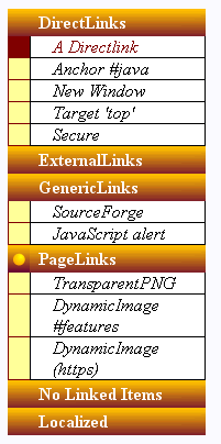
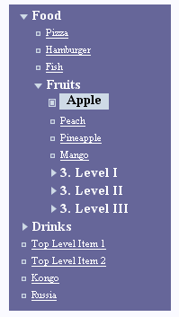
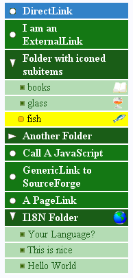
The following three screenshots are made from the examples, that
are referenced in this docu.
Click on the images to see them with full JavaScript dynamics in action.
| 1 : Simple example | 2 : Forrest 'reproduction' | 3 : Advanced example |
 |
 |
 |
Property reference
NavigationBar
| Name | Type | Required | Default Value | Description |
|---|---|---|---|---|
| listener | org.apache.tapestry. IActionListener |
No | - |
The listener-method that is invoked by all items with DirectLink.
Per default, the DirectLink parameter is just the item id. In this case the method is supposed to have the signature (IRequestCycle, String). To change the DirectLink (and ExternalLink) parameters, use the dynamicProperties-parameter |
| source | Iterable<INavBarItem> | No |
The item model.
For XML-models, use the xmlSource parameter. Exactly one of the parameters 'source' or 'xmlSource' must be provided. See how to construct the model with the API |
|
| xmlSource | IAsset | No |
An asset, that contains the item structure as XML.
DTD : http://sotacs.sourceforge.net/dtds/navigation-bar_0.7"/>.dtd public id : -//sf//sotacs//NavigationBar//EN Exactly one of the parameters 'source' and 'xmlSource' must be provided. |
|
| initiallyOpened | String | No | null | comma-separated list of item's ids that will be opened on page's start. The default (null) means, that all nodes start collapsed except for the path, that contains the selected node. The selected item is always visible. |
| selected | String | No | The item-id that will be rendered in 'selected' mode. This item will be visible, i.e. all its containing folders are open. | |
| value | INavBarItem | No | If provided, the parameter is updated with the current value when the items are rendered. Within the nested NavigationItem components, this may be used to introduce content into the items. | |
| level | int | No |
If provided, the parameter is updated with the hierarchical level of
the current item.
See the Forrest example of how this can be used. |
|
| itemMode | ItemMode | No |
If provided, the parameter is updated with the current
item mode while the items are rendered.
Each NavigationItem tag can be declared to render several modes,
if the appearance of those modes differs only by some icon, color or the like.
This value can be used to distinguish the current mode.
See the Forrest example of how this can be used to render the open/closed folders within one table row. |
|
| dynamicProperties | IDynamicItemPropertiesProvider | No |
Even though you could dynamically create a model for each request, the model
is per default considered
static. This increases performance dramatically.
In addition to the static model, you may want to dynamically hide some items. This is also used to provide link parameters others than the default parameter which is just the item's id. |
|
| dynamic | boolean | No | false |
If you want your model or the 'type'-properties of the nested NavigationItems
to change dynamically, set this parameter to true.
Otherwise (per default) the model and the type parameters are assumed to be static, which results in a significant performance gain. This parameter shall not be set to true if the cache parameter is bound. |
| cache | String | No |
An arbitrary caching key (application-wide) for caching the HTML-structure.
Only alphanumeric characters or '_'. If caching is used, server-CPU-usage and network traffic caused by the navigation bar, decreasedramatically. This can be used very effectively to cache navigation bars in border components. See how to use caching This parameter shall not be provided if the 'dynamic'-parameter is set to true. |
|
| encoding | String | No | If caching is used and there are non-ascii characters included in the menu's html, set this to the charset encoding. utf-16 is a good value for many exotic character sets. | |
| element | String | No | TABLE |
The HTML-tag that contains the items. Per default this is a TABLE
(in this case all NavigationItems must be TR elements)
but you are free to use UL, OL, DIV, or whatever you like.
(Of course the nested NavigationItem's HTML-elements must correspond to the surrounding element) |
Body : allowed all elements with Tapestry-type NavigationItem are considered as view elements. All other elements inside the body are ignored.
Informal parameters : allowed. The informal parameters are added to the top-level navigation bar element (in most cases the 'table'-tag)
Reserver parameters : id
NavigationItem
| Name | Type | Required | Default Value | Description |
|---|---|---|---|---|
| type | String | Yes | - |
Comma separated list specifying the item-types and
dynamic modes, you want this element to render
See the detailed description of what are the dynamic modes and how to use this parameter. |
| element | String | No | TR |
The HTML tag for the rendered item.
In most cases this is the same element name as the static preview element. All informal parameters and some event-handlers are added to this tag |
Body : allowed:
Informal parameters : allowed. The informal parameters are added to the rendered element
Reserved parameters : onmousedown, onmouseover, id
How to build a Navigation Bar
See the tutorial of how to build a simple and instructive Example
-
Build a static preview (a table or list or whatever you want).
Add a row for each different item type or mode. To have a nice preview feeling, you may want to add several rows of some type.
-
Specify an
XML-model or construct the model with the
Java model API.
Each item has at least a value (caption), an id and a type atrribute.
-
Specify the item-types and modes, you want each HTML-row to render. This is accompished with
the
NavigationItem component and its type attribute.
See the details about the modes and how to specifiy the type attribute.
The dynamic Modes and how to use the NavigationItems type attribute
Each item has a type and a mode.
The type parameter of the NavigationItem is the place, you declare
which type(s) and mode(s) you want to be rendered by the corresponding HTML-row.
Now, what is a type and a mode?
- The items type is specified in the model.
it never changes (unless you make a dynamic model)
Type names are free. You can use as many as you like. - The mode changes frequently. It changes on user actions on the browser
(mouse-over, mouse-out, open/close folders)
or changes on the server, when an item gets or looses selection status.
There are 6 item modes. They are the String reprsentations of the enumeration net.sf.sotacs.navbar.api.ItemMode
The Modes
| Name | Required | Default | Description |
|---|---|---|---|
| OUT | Yes | - |
Mouse out, not-selected.
If the item has children, this is the 'closed mode' This mode must be declared for each item type in some NavigationItems type attribute! |
| OVER | NO | OUT |
Mouse over, not-selected.
If the item has children, this is the 'closed mode' |
| OUT_OPEN | NO | OUT |
Mouse out, not-selected.
If the item has children, this is the 'open mode' |
| OVER_OPEN | NO | OVER |
Mouse over, not-selected.
If the item has children, this is the 'open mode' |
| OUT_SEL | NO | OVER_OPEN |
Mouse out, selected.
selected folders are always open |
| OVER_SEL | NO | OUT_SEL |
Mouse over, selected.
selected folders are always open |
The type attribute specifies the type and mode in the general form
type="type-1;mode-1[|mode-2|...|mode-n], ... ,type-2;mode-1[|mode-2|...|mode-n]"
For example
type="folder;OUT"
just declares the row to render the folder type in mode OUT
The following declares the row to render the folder type in mode OVER and the
item type in the mouse-over and selected mode.
type="folder;OVER, item;OVER|OUT_SEL"
All modes except OUT default to some other mode. OUT must be declared for each type.
If some modes differ only by some icon or a CSS-class you can declare these modes in a single NavigationItem and use the itemMode binding parameter to distinguish between the modes in the rendering. The ItemMode enum has some boolean-valued methods like isOpened() or isOver() to facilitate this.
Construct the model with XML
Links
All Tapestry standard links (DirectLink, ExternalLink, PageLink, GenericLink, Servicelink)
with their corresponding attributes are supported.
The model of the Simple example demonstrates the different links and their options.
New Window links
There is additional limited new window functionality :
The attributes newWindowName and newWindowInitString are the 2nd and
(optional) 3rd arguments of the JavaScript window.open(..) function.
Call JavaScripts
To call JavaScripts, use the notation:
<genericLink href="javascript:someFunction()" />
Icons and item-individual properties
Sometimes you may want to assign more information to an item than the value (caption) and the type.
This is what the icon, property and boolean elements are made for.
You can assign icon-urls, String properties and boolean properties to each individual item
and access them with OGNL using the methods of the current item's
INavBarItem interface
which can be bound to the
value
parameter of NavigationBar.
The Advanced example
demonstrates the use of individual icons.
Localization of captions
To localize the captions, use the notation
... value="message:myMessageKey"
The property files are looked up in the page's namespace (standard i18n of Tapestry)
The Simple example
demonstrates how to localize captions.
<?xml version="1.0" encoding="UTF-8"?>
<!--
The DTD for the NavigationBar component of the 'sotacs' collection of Tapestry components.
Associated with the public identifier:

	-//sf//sotacs//NavigationBar0.7//EN

The canonical location for the DTD is:

	http://sotacs.sourceforge.net/dtds/navigation-bar_0.7.dtd

the root element is navigation. -->

<!ELEMENT navigation (item+) >

<!ELEMENT item ((directLink|genericLink|pageLink|externalLink|serviceLink)?,(icon|property|boolean)*,item*)>
<!ATTLIST item type CDATA #REQUIRED>
<!ATTLIST item value CDATA #REQUIRED>
<!ATTLIST item id CDATA #REQUIRED>

<!ELEMENT icon EMPTY>
<!ATTLIST icon type (classpath|context|generic) #REQUIRED>
<!ATTLIST icon path CDATA #REQUIRED>
<!ATTLIST icon key CDATA #REQUIRED>

<!ELEMENT property EMPTY>
<!ATTLIST property key CDATA #REQUIRED>
<!ATTLIST property value CDATA #REQUIRED>

<!ELEMENT boolean EMPTY>
<!ATTLIST boolean key CDATA #REQUIRED>
<!ATTLIST boolean value (true|false) #REQUIRED>

<!ELEMENT directLink EMPTY>
<!ATTLIST directLink anchor CDATA #IMPLIED>
<!ATTLIST directLink target CDATA #IMPLIED>
<!ATTLIST directLink newWindowName CDATA #IMPLIED>
<!ATTLIST directLink newWindowInitString CDATA #IMPLIED>
<!ATTLIST directLink scheme (http|https) #IMPLIED>

<!ELEMENT genericLink EMPTY>
<!ATTLIST genericLink href CDATA #REQUIRED>
<!ATTLIST genericLink target CDATA #IMPLIED>
<!ATTLIST genericLink newWindowName CDATA #IMPLIED>
<!ATTLIST genericLink newWindowInitString CDATA #IMPLIED>

<!ELEMENT pageLink EMPTY>
<!ATTLIST pageLink page CDATA #REQUIRED>
<!ATTLIST pageLink anchor CDATA #IMPLIED>
<!ATTLIST pageLink target CDATA #IMPLIED>
<!ATTLIST pageLink scheme (http|https) #IMPLIED>
<!ATTLIST pageLink newWindowName CDATA #IMPLIED>
<!ATTLIST pageLink newWindowInitString CDATA #IMPLIED>

<!ELEMENT externalLink EMPTY>
<!ATTLIST externalLink page CDATA #REQUIRED>
<!ATTLIST externalLink anchor CDATA #IMPLIED>
<!ATTLIST externalLink target CDATA #IMPLIED>
<!ATTLIST externalLink scheme (http|https) #IMPLIED>
<!ATTLIST externalLink newWindowName CDATA #IMPLIED>
<!ATTLIST externalLink newWindowInitString CDATA #IMPLIED>

<!ELEMENT serviceLink EMPTY>
<!ATTLIST serviceLink service CDATA #REQUIRED>
<!ATTLIST serviceLink target CDATA #IMPLIED>
<!ATTLIST serviceLink scheme (http|https) #IMPLIED>
<!ATTLIST serviceLink newWindowName CDATA #IMPLIED>
<!ATTLIST serviceLink newWindowInitString CDATA #IMPLIED>
Build the model with the API
Alternatively to the XML-model, you can construct the model per API using the package
net.sf.sotacs.navbar.api.item
- Bind the model to the source parameter
- Construct the model
Example
public class ModelPerAPI {
	public Iterable<INavBarItem> getModel(){
	  ArrayList<INavBarItem> model = new ArrayList<INavBarItem>();

	  NonLinkedItem folder = new NonLinkedItem("folder","id1","caption 1");
		  folder.addItem(new GenericLinkedItem("subitem","generic1", "sf.net", "http://www.sf.net"));
		  folder.addItem(new ExternalLinkedItem("subitem","ext1", "start", "Home"));
		  folder.addItem(new PageLinkedItem("subitem","page1", "contact us", "Contact"));
	  model.add(folder);
	  DirectLinkedItem folder2 = new DirectLinkedItem("folder","id2","I have a link");
	      folder2.setAnchor("theAnchor");
		  folder2.addItem(new GenericLinkedItem("subitem","generic2", "sf.net", "http://www.sf.net"));
		  ExternalLinkedItem extItem = new ExternalLinkedItem("subitem","ext2", "start", "Home");
			  extItem.setScheme("https");
			  extItem.setTarget("top.right");
		  folder2.addItem(extItem);
		  folder2.addItem(new PageLinkedItem("subitem","page2", "contact us", "Contact"));
	  model.add(folder2);
	  model.add(new DirectLinkedItem("toplevelitem", "item3", "news"));
	  model.add(new DirectLinkedItem("toplevelitem", "item4", "events"));
	  return model;
	}
}
Caching and Dynamics
There are several components, that determine the appearance of the final navigation bar on the client:
- The model
- Localization
- Dynamic item-hiding or dynamic link-parameters that are provided by the IDynamicItemPropertiesProvider instance bound to the dynamicProperties parameter.
- The selected item
- The content of the type-parameters of the NavigationItem components
- And last but not least any dynamic Tapestry components like @If, @Any, @Insert, etc.. that are nested in the NavigationItem-rows to render the items.
Very Dynamic Navigation Bars
If the model is dynamic (constructed on each request per API) or the values bound to the type-parameters are not constant, you must set the dynamic-parameter to true. The default is 'false', since both conditions are really unusual. 'Very dynamic' bars give rise to some additional processing overhead on the server.
Cacheable Navigation Bars
If a navigation bar is not very dynamic in the above sense, it is usually even cachable.
- The model is static (component 1 in the above list)
- The binding to the type parameters of the NavigationItem-rows remains the same (component 5 in the above list)
- The rendering (component 6 in the above list) gives the same result on each request. This means that dynamic components (like @If, @Any, @insert, etc..) depend only on values from the model, localization or other static ressources.
Note that this is a very weak requirement because
- localization doesn't affect caching. There is a version cached for each local.
- You can still dynamically hide items or provide dynamic link parameters, using a IDynamicItemPropertiesProvider together with the component's dynamicProperties parameter.
- The item's destination urls are completely unaffected from caching. So, any dynamic state information, encoded by Tapestry in the urls works dynamically as expected
Caching is recommended because otherwise, the generated HTML may result quite large, since there
is gererated a hidden element of each item and all its different dynamic modes.
To switch on caching, just provide a caching key to the
cache-parameter.
That's all! With caching you get very thin HTML and reduce nearly completely
the server's CPU processing for the component!
The cache-parameter doesn't expect a boolean but a String-valued caching key,
because usually this component
will be included in a border-component appearing on many different pages and
all those components are 'different components' in the Tapestry logic.
To mark all these 'different' components to have the same cached structure,
just specify a caching-key to the navigation bar component.
As a result, the large HTML structure is shifted into
a .js library (and hence is cached even on the browser).

